Task 3 – 1500 Word Essay and References

Essay

“What is an ocean, but a multitude of drops?”

David Mitchell personifies the potential that individuals bring to the world, yet shows how they hide away their intelligence to conform to the ways of society. Mitchell plays on the fact that we, as humans, don’t ever dare risk to change. We’re stuck within a giant bubble that protects us and altering a minor moment within our lives, could cause us to stray from the norm. However, such fantasy and desire can be found within the pages of a book.

The given brief states “A small independent book shop is opening soon in Worcester. It doesn’t have a name or a brand, and therefore no retail concept…Your job as creative designer, is to come up with a concept, a name, a brand and then an identity.” From this, a range of prints should be created. Outputs such as; a mood board, external shop graphics, shop apparel (such as price tags and bags), a large format advertising poster, a small press advert, a leaflet or brochure, and a social media campaign are all needed to give the store it’s own identity.

To get a feel of how the store will work within the high street, research was made into the main competitors the shop faces. Here, Waterstones, WHSmith and The Works were found to be the top three selling bookstore chains, therefore, making them the ideal competition. After conducting a quick survey, it came to attention that out of the three said competitors, a vast majority of people preferred to buy from Waterstones. This resulted in further research being conducted into the chain, to show how the new shop will have to compare in order for a high profit to be made and a strong flow foot-traffic to consistent.

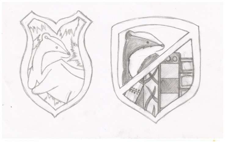
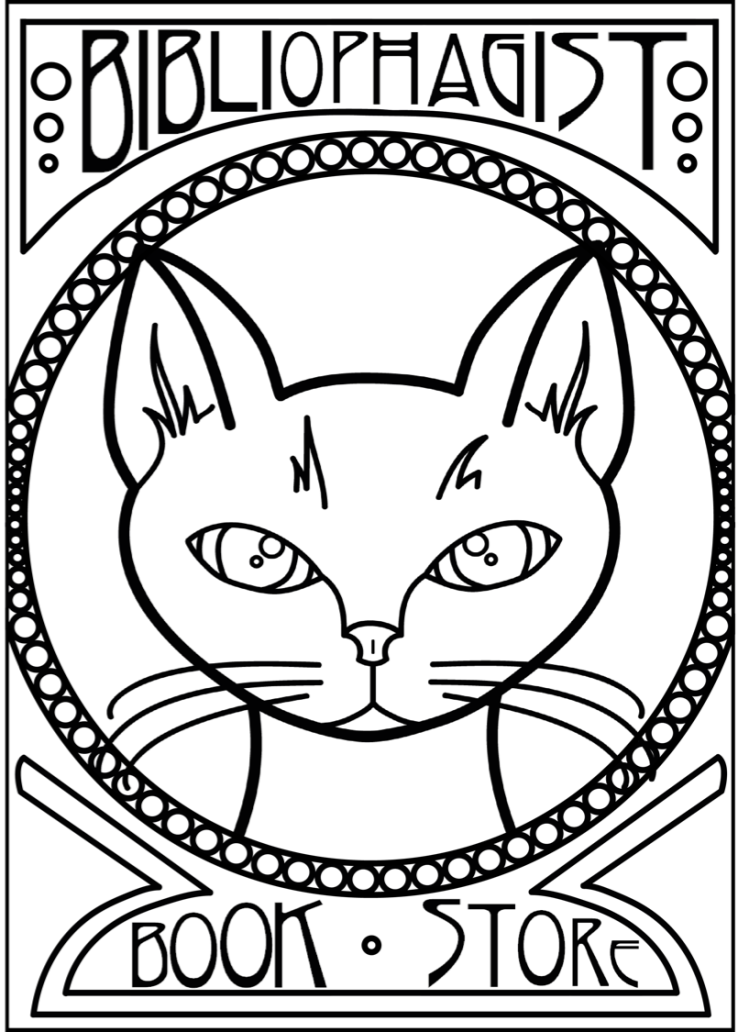
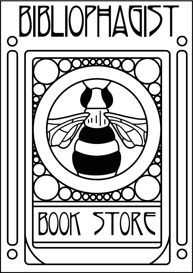
To begin creating an identity for the store, a logo and name must be decided upon. Here, the main attributes set to show a consistent flow throughout the store’s identity, were a warm welcoming, natural and homely feel, with a strong Art Nouveau-vibe. From this, a personality began to form around the Harry Potter house; Hufflepuff. It is said that a Hufflepuff holds the traits of loyalty, patience, hard work, dedication and kindness, all of which harmonise with the store’s character. Here upon, a logo started to form around the Hufflepuff mascot; a European badger. Nevertheless, the badger design was sooner curbed, in order for a stronger Art Nouveau inspired design to take it’s place. Here, the final logo design was rich with floral stylings, elegant shapes and a decorative finish, all consistent with the Art Nouveau design movement. To add the final touches to the store’s emblem, a name was given. Bibliophagist. Described by Collins Dictionary as “a person who devours books”, the given title was in complete conformity with the ongoing adaptation of the store’s identity.

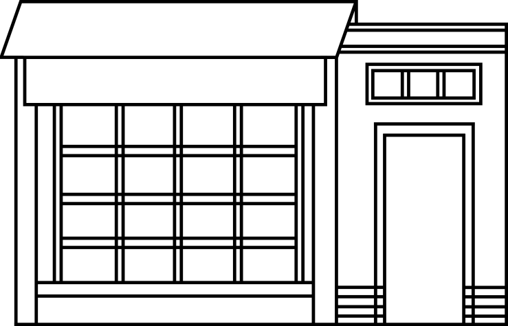
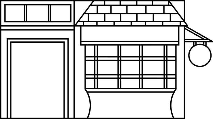
Upon this completion, the shop’s character was further developed through an external design. Here, further research was made into the Art Nouveau design movement, and the designers behind it’s success. Such an influential designer from said period, was Scottish artist and architect Charles Rennie Mackintosh. Recognised for his strong floral themes, earthy tones and natural patterns, Mackintosh is thus well known for the design of the Glasgow School or Art, which has often been considered to be Mackintosh’s masterpiece.

From this, several initial sketch designs were designed, with the development of various concepts made further. Here, a final external look was settled upon, and the outside of the store would show both a strong bohemian and Art Nouveau influence, with a vast range of recycled materials being used within the build. A green roof would be located on the top of the building to act as a growing medium for the flora around, as well as to reduce heat loss and, to allow the store to collect it’s own water. As stated by the University of Toronto, “green roofs can help reduce heat loss and energy consumption during cold months.” As well as “reducing the need for air conditioning on hot days.” Thus proving the store will be able to help reduce the global warming impact on the environment, at the same time as saving the owners money on heat and electricity.

Once the external design was complete, concept generation began on the internal features of the store. Items such as tags and bags were fully designed to clearly represent the store’s identity. With the final concept of the store’s tags implying a strong sense of love and warmth, the added handcrafted feature gave a simply home-made touch. Taking strong inspiration from the Etsy store ‘The Altered Diaries’, the uniquely styled tags and labels were created using a vast collection of recycled materials, coloured buttons, stamps and much more. Pieced together with a simple bit of string, added greatly to the bohemian-stylings of the store.

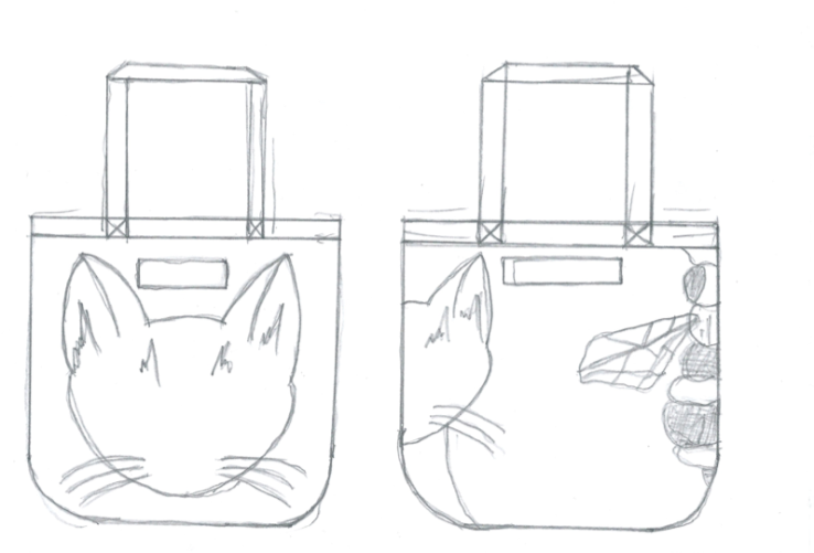
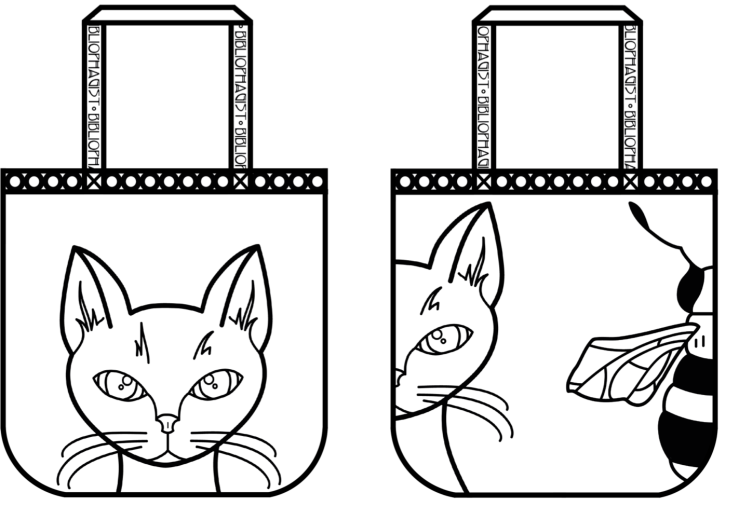
Following on from the tag design, a strong bag concept started to form. The simple hand rendered designs showed a connection to the natural flora and fauna of the earth, with such characters as an Art Nouveau-styled cat and bee, being the main design. A final concept was decided upon, with the tote being made from fully recyclable materials as well as black and white ink (as to reduce production times and costs, as well as to increase how much of the bag can be recycled once used).

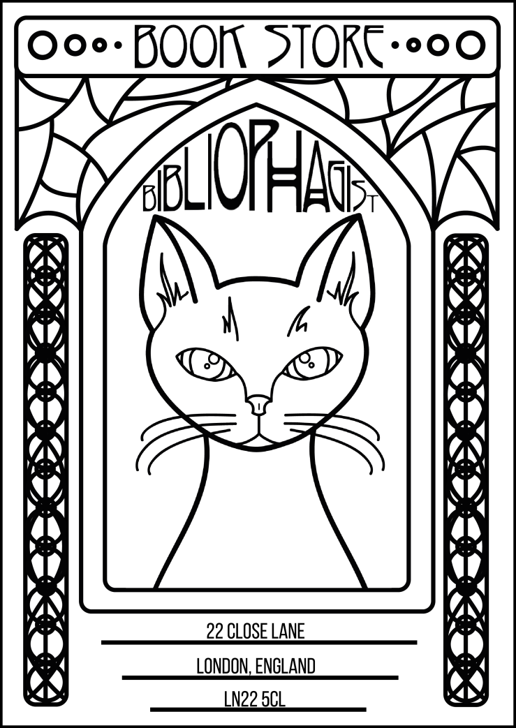
Once the physical appearance of the shop had been created, it was time to move onto the advertising portion. To start off with, a large form poster was created. This poster would be placed in a range of different locations such as bus shelters, hoardings, and ad shells. Because of this the final design shall be either screen printed, or printed via offset lithography, with an added lamination, to prevent moisture seeking in. If the poster is to be double sided, reverse printing shall be used in order to reduce the amount of paper needed. The inks used within the given printing methods are all weather/waterproof, due to the UV sealant added, thus meaning no ink will smudge or fade due to wear from the weather.

Again, the final poster design shows a strong connection to the Art Nouveau movement, with the use of floral stylings and natural shapes. As well, the typeface used (Rivanna, by Nick’s Fonts), works on the desired stylings of the Art Nouveau theme, with the long lettering and curved styles give a strong Nouveau-feel to the finished concept, allowing the store’s theme to be shown, and felt, throughout the poster as well. Moving on, the small press advert took the form of a niche magazine. It is said that, “Niches do not ‘exist’ but are ‘created’”, by marketing organisations to fill the requirements and desires of a specific segment of the population. Here, soft, earthy tones, complete with natural shaped and symmetrical stylings, have been used to contrast the given text. The text used, in poem form, add an extra sense of depth and definition to the store, as well as keeping the readers interested and intrigued.

To go along with the large format poster, and the small press advert, an additional leaflet was created. The final leaflet design shall be printed on 130gsm Eco Kraft Paper. The use of Eco Kraft Paper, not only reduces the cost for production, but will also mean the manufacture will not produce so much chemical waste during production, thus making it better for the environment in the long run. Printed on a standard A5 sizing, the design shall easily standout and contrast against all the other leaflets posted through your door.

As a final piece of advertisement, a social media campaign has been developed. BigCommerce.com states the definition of a social media campaign as a “coordinated marketing effort to reinforce or assist with a business goal, using one or more social media platforms.” After brainstorming a few different ideas, a final design was set upon. Here, all throughout the town where the store is located, there will be a vast range of solar powered fairy lights hanging from place to place. Attached to the lights will be arrows pointing in the direction of the store. When the audience begin to follow the lights, it will take them on a journey through the town and towards the shop. As they get closer, more and more lights will be placed on trees and plants around the store front, to light up the entrance, thus drawing people in.

The fairy lights used will be a simple, colourless glow, as to symbolise the natural light from the sun, and shall be a range of different shapes and sizes. The lights will be solar powered, allowing them to be lit 24/7, without the use of electricity and power supplies. To allow the design to fit in with the social media campaign side of the advertisement, selected members of the public will be videoed following the lights all the way to the store. Along the way, the camera will pan round the trail, to reveal the vast range of flora and fauna around. The videos will then be uploaded to social media such as Facebook, Instagram and Twitter, allowing the word to spread.

References

Draw Cut Ink Press. 2016. Top Linocut Artists to Follow on Instagram. [Online]. [Assessed 5 November 2016]. Available from: http://www.drawcutinkpress.com/top-linocut-artists-to-follow/

Pragel, M. 2011. Assignment Six. [Online]. [Assessed 5 November 2016]. Available from: https://meganpragel.wordpress.com/2011/03/

Duck Print Fine Art Limited Editions. 2010. Techniques. [Online]. [Assessed 5 November 2016]. Available from: http://www.duckprintfineart.com.au/techniques/

EMPIRE. [No Date]. Home. [Online]. [Assessed 7 January 2017]. Available from: http://www.empireonline.com

K, Vanessa. 2013. Who is the Target Audience for These Magazines?. [Online]. [Assessed 7 January 2017]. Available from: https://prezi.com/otgt-os0dx__/who-is-the-target-audience-for-these-magazines/

N, John. 2016. Empire’s Exclusive Rogue One Subscriber-Only Cover Revealed. [Online]. [Assessed 7 January 2017]. Available from: http://www.empireonline.com/movies/news/empire-exclusive-rogue-one-subscriber-cover-revealed/

Pottermore. No Date. Hufflepuff Common Room. [Online]. [Assessed 7 January 2017]. Available from: https://www.pottermore.com/writing-by-jk-rowling/hufflepuff-common-room

B, Michael. 2015. Skate The World. [Online]. [Assessed 7 January 2017]. Available from: http://www.thrashermagazine.com/articles/skate-the-world-interview/

J, Mark. 2016. 11 New Suicide Squad Character Posters. [Online]. [Assessed 7 January 2017]. Available from: https://www.comicbookmovie.com/suicide_squad/11-new-suicide-squad-character-posters-a142746

J, Dan. 2016. Suicide Squad Review. [Online]. [Assessed 7 January 2017]. Available from: http://www.empireonline.com/movies/suicide-squad/review/

Y, Desamba. 2013. 40 Creative Paper Bag Design Ideas. [Online]. [Assessed 7 January 2017]. Available from: http://jayce-o.blogspot.com/2013/01/paper-bag-design-ideas-packaging-design.html

026Designs. 2014. 12 Retro Labels/Price Tags. [Online]. [Assessed 7 January 2017]. Available from: https://creativemarket.com/026design/21602-12-Retro-Labels-Price-Tags

Mc, Louise. 2016. Suicide Squad: Watch Jared Leto Transform into the Joker in this Behind-the-Scenes Video. [Online]. [Assessed 7 January 2017]. Available from: http://www.digitalspy.com/movies/suicide-squad/news/a813921/suicide-squad-jared-leto-transforms-into-the-joker-behind-the-scenes-video/

C, Adam. 2016. ‘Suicide Squad’: Margot Robbie on Understanding Harley Quinn, Cracking the Joker, and Fighting in Heels. [Online]. [Assessed 7 January 2017]. Available from: http://collider.com/suicide-squad-margot-robbie-interview/

L, Dirk. 2016. What Suicide Squad’s Behind the Scenes Issues Were Actually About. [Online]. [Assessed 7 January 2017]. Available from: http://www.cinemablend.com/news/1541359/what-suicide-squads-behind-the-scenes-issues-were-actually-about

G, Rebecca. 2015. Techniques. [Online]. [Assessed 7 January 2017]. Available from: https://designschool.canva.com/blog/what-is-the-golden-ratio/

Anon. 2010. Ration in Other Medium – Magazine. [Online]. [Assessed 7 January 2017]. Available from: https://samcox891.wordpress.com/2010/10/21/ratio-in-other-medium-magazines/

M, Mike. 2009. Letter Pressed: Mike Maxwell. [Online]. [Assessed 6 November 2016]. Available from: http://www.pressingletters.com/tag/letter-pressed/

The Art Stuff. 2013. Deborah Klein – Artist. [Online]. [Assessed Assessed 6 November 2016]. Available from: http://artstuff.net.au/deborah-klein-artist/

K, Deborah. 2011. Deborah Klein’s Art Blog. [Online]. [Assessed Assessed 6 November 2016]. Available from: http://deborahklein.blogspot.co.uk/2011_03_01_archive.html

Beauton Art Gallery. 2012. Dance of Death. [Online]. [Assessed Assessed 6 November 2016]. Available from: http://www.beautonart.com/illustration-nudes-people-surrealism-dance-death-simon-vaeth

R, Olivia. 2014. Popular Printing Methods Today. [Online]. [Assessed Assessed 6 November 2016]. Available from: http://www.printingdeals.org/specials/popular-printing-methods.html

B Colin. [No Date]. What Is Etching?. [Online]. [Assessed Assessed 6 November 2016]. Available from: http://www.limitededitionprints.info/what-is-etching.html

C, Áine. 2013. Copper Plate Etching Prints. [Online]. [Assessed Assessed 6 November 2016]. Available from: https://www.behance.net/gallery/6849273/Copper-Plate-Etching-Prints

Anna. [No Date]. Hufflepuff Aesthetic. [Online]. [Assessed 7 January 2017]. Available from: http://weheartit.com/amapofyourstars/collections/99980135-hufflepuff-aesthetic?page=2&before=38318700

Anon. 2015. WH Smith PLC Preliminary Results Announcement for the Year Ended 31 August 2015. [Online]. [Assessed 7 January 2017]. Available from: http://www.whsmithplc.co.uk/docs/Press_Release_Prelims_2015_Combined_FINAL.pdf

A, Ashley. 2016. Waterstones Turns a Page as Sales Rise. [Online]. [Assessed 7 January 2017]. Available from: http://www.telegraph.co.uk/finance/newsbysector/retailandconsumer/12137948/Waterstones-turns-a-page-as-sale-rise.html

The Works Stores LTD. [No Date]. Techniques. [Online]. [Assessed 7 January 2017]. Available from: http://www.theworks.co.uk/page/corporate-financials

WHSmith. 2016. Home. [Online]. [Assessed 7 January 2017]. Available from: https://www.whsmith.co.uk/?gclid=CKSJjPSC29ACFei37QodQcMELg

Waterstones. 2016. Home. [Online]. [Assessed 7 January 2017]. Available from: https://www.waterstones.com

The Works. 2016. Home. [Online]. [Assessed 7 January 2017]. Available from: http://www.theworks.co.uk/?gclid=CJTw8oCD29ACFc277Qod7GcFKA

Anon. [No Date]. WHSmith. [Online]. [Assessed 7 January 2017]. Available from: http://www.leedsbradfordairport.co.uk/at-the-airport/shop/whsmith

Richmond Shopping Centre. 2015. The Works. [Online]. [Assessed 7 January 2017]. Available from: http://www.richmondcentre.co.uk/Store/the-works/

D, James. 2015. Quotes from Sir Alex Issigonis on the Mini and More. [Online]. [Assessed 1 November 2016]. Available from: http://www.thedailytoggle.com/quotes-from-sir-alec-issigonis-on-the-mini-and-more/

A, Keith. 2011. People: Sir Alec Issigonis. [Online]. [Assessed Assessed 1 November 2016]. Available from: http://www.aronline.co.uk/blogs/facts-and-figures/people/people-sir-alec-issigonis/

The Altered Diaries. 2010. Home. [Online]. [Assessed 7 January 2017]. Available from: https://www.etsy.com/uk/shop/TheAlteredDiaries?ref=l2-shopheader-name

T, McGee. 2010. The Only Guide You Will Ever Need to Art Nouveau. [Online]. [Assessed 7 January 2017]. Available from: http://chibirhm.livejournal.com/519432.html

T, Oliver. 2014. 10 Words Every Book Lover Should Know. [Online]. [Assessed 7 January 2017]. Available from: http://www.huffingtonpost.com/oliver-tearle/10-words-every-book-lover-should-know_b_5297284.html

History of Art Nouveau. [No Date]. Image Database. [Online]. [Assessed 7 January 2017]. Available from: http://artnouveau.randallbruder.com

F, Lili. 2015. 10 Words for Book Lovers. [Online]. [Assessed 7 January 2017]. Available from: http://blog.oxforddictionaries.com/2015/08/unusual-words-for-book-lovers/

Collins English Dictionary. [No Date]. Definition of Bibliophagist. [Online]. [Assessed 7 January 2017]. Available from: https://www.collinsdictionary.com/dictionary/english/bibliophagist

Cargo Collective. 2012. Art Nouveau Poster. [Online]. [Assessed 7 January 2017]. Available from: http://cargocollective.com/workingengine/Art-Nouveau-Poster

Design in English. 2012. Art Nouveau Posters. [Online]. [Assessed 7 January 2017]. Available from: https://designinenglish.wordpress.com/art-nouveau-posters/

H, Adam. [No Date]. Absinthe Label & Print. [Online]. [Assessed 7 January 2017]. Available from: http://www.velcrosuit.com/filter/illustration/Absinthe-Label-Print

Geekologie. 2013. Art Nouveau Posters for Studio Gihbli Film Characters. [Online]. [Assessed 7 January 2017]. Available from: http://geekologie.com/2013/09/art-nouveau-posters-for-studio-gihbli-fi.php

History of Advertising. [No Date]. Art Nouveau. [Online]. [Assessed 7 January 2017]. Available from: http://historyofads.old.the-voice.com/art-nouveau

Anon. 2008. Art Nouveau in Advertising. [Online]. [Assessed 7 January 2017]. Available from: https://apah.wikispaces.com/Art+Nouveau+in+Advertising

Forge22 Design. [No Date]. ROGUE! Art Nouveau Poster and Flyer for French Vaudeville Show. [Online]. [Assessed 7 January 2017]. Available from: http://www.forge22.com/projects/rouge-art-nouveau-poster-and-flyer-for-french-vaudeville-show/

L, Gerren. 2013. Art Nouveau & Art Deco as Design Inspiration. [Online]. [Assessed 7 January 2017]. Available from: http://www.designworklife.com/2013/08/27/art-nouveau-art-deco-as-modern-design-inspiration/

Business Dictionary. [No Date]. Niche Marketing. [Online]. [Assessed 7 January 2017]. Available from: http://www.businessdictionary.com/definition/niche-marketing.html

T, Sadie L. 2015. 25 of the Best Book Quotes of all Time. [Online]. [Assessed 7 January 2017]. Available from: https://www.bustle.com/articles/121359-25-of-the-best-book-quotes-of-all-time

S, Patrick. 2013. 22 of the Most Niche Magazines the World Has Known. [Online]. [Assessed 7 January 2017]. Available from: https://www.buzzfeed.com/patricksmith/the-most-niche-magazines-the-world-has-ever-known?utm_term=.ltZNeYnjL#.tyJzVGyvw

A, Brian. 2010. Is this the Most Niche Gaming Magazine in the World?. [Online]. [Assessed 7 January 2017]. Available from: http://www.kotaku.com.au/2010/11/is-this-the-most-niche-gaming-magazine-in-the-world/

L, Marcus. 2016. Kpop Magazines Researched. [Online]. [Assessed 7 January 2017]. Available from: http://chchsmarcus.blogspot.co.uk/2016/05/kpop-magazines-researched.html

O, Angela F. 2011. Art Nouveau. [Online]. [Assessed 7 January 2017]. Available from: http://gicde.blogspot.co.uk/2011/02/art-nouveau.html

C, Julianne K. 2010. Art Nouveau. [Online]. [Assessed 7 January 2017]. Available from: http://juliannecostello.com/project_posters_ArtNouveau.html

HappyBigBang. 2010. [PHOTOS] Big Bang Featured on MERLITO Kpop Magazine!. [Online]. [Assessed 7 January 2017]. Available from: http://happybigbang.blogspot.co.uk/2010/09/photos-big-bang-featured-on-merlito.html

BigCommerce. 2015. What is a Social Media Campaign? How to Increase Social Sales. [Online]. [Assessed 7 January 2017]. Available from: https://www.bigcommerce.co.uk/ecommerce-answers/what-is-a-social-media-campaign/

E, Emma. 2016. The Most Absurd Deadpool Marketing, from Tinder to Obscene Emoji. [Online]. [Assessed 7 January 2017]. Available from: https://www.wired.com/2016/02/deadpool-marketing/

Emirates. 2016. Jen’s Back and She’s Made a New Friend. [Online]. [7 January 2017]. Available from: https://www.emirates.com/english/flying/jennifer-aniston.aspx?utm_medium=social_organic&utm_source=youtube&utm_campaign=jenniferaniston2016&stop_mobi=yes

Chatbooks. [No Date]. Home. [Online]. [Assessed 7 January 2017]. Available from: https://chatbooks.com

Famous Authors. 2014. List of Famous Authors. [Online]. [Assessed 7 January 2017]. Available from: http://www.famousauthors.org/list

The Stencil Library. [No Date]. Motif No 72. [Online]. [Assessed 7 January 2017]. Available from: http://www.stencil-library.co.uk/artnouveau-motif-stencils/001796-ARN0125-4/motifno72stencil.html

Inkind Design. 2016. Art in Advertising: Art Nouveau. [Online]. [Assessed 7 January 2017]. Available from: http://www.inkind-design.com/single-post/2016/11/28/Art-in-Advertising-Art-Nouveau

FantastikGranollers. 2016. Nous Cartells Promocionales De “Suicide Squad”. [Online]. [Assessed 7 January 2017]. Available from: http://www.fantastikgranollers.cat/simple/blog/page/2/

Arcata Artisans. 2006. Marshal Mello. [Online]. [Assessed 7 January 2017]. Available from: http://arcataartisans.com/artists/marsha_mello/

ALocalPrinter. 2016. Leaflet Pritning. [Online]. [Assessed 7 January 2017]. Available from: http://www.alocalprinter.co.uk/products/flyers-leaflets/leaflets

OAAA. [No Date]. Bus Shelters. [Online]. [Assessed 7 January 2017]. Available from: https://oaaa.org/OutofHomeAdvertising/OOHMediaFormats/BusShelters.aspx

Hometalk. 2016. DIY Projects, Crafts and Ideas for the Home and Garden. [Online]. [Assessed 7 January 2017]. Available from: https://uk.pinterest.com/pin/486248090991320325/

L, Sonnet. 2005. Green Roofs in Winter: Hot Design for a Cold Climate. First Conclusive Data About Green Roofs on Exhibit at the Design Exchnage. [Online]. [Assessed 7 January 2017]. Available from: https://web.archive.org/web/20080411230309/http://www.news.utoronto.ca/bin6/051117-1822.asp

Simply The Nest. 2009. The Magical Nest By Night. [Online]. [Assessed 7 January 2017]. Available from: http://www.simplythenest.com/journal/2009/10/15/the-magical-nest-by-night.html

SHINE. 2016. Before I Die. [Online]. [Assessed 7 January 2017]. Available from: http://shineonstpete.com/portfolio/before-i-die/

Before I Die. [No Date]. Home. [Online]. [Assessed 7 January 2017]. Available from: http://beforeidie.cc/site/

O, London. [No Date]. Christmas Backyard Cinema at Winterville. [Online]. [Assessed 7 January 2017]. Available from: http://onin.london/christmas-backyard-cinema-at-winterville/

Admin. 2016. Fairy Lights Outdoor. [Online]. [Assessed 7 January 2017]. Available from: http://warisanlighting.com/fairy-lights-outdoor.html

D, Eunice. 2015. Top 10 Influential Social Medial Campaigns of 2015. [Online]. [Assessed 7 January 2017]. Available from: https://www.adherecreative.com/blog/top-10-influential-social-media-marketing-campaigns-of-2015

W, James. 2016. New Fantastic Beasts And Where To Find Them Character Posters Arrived. [Online]. [Assessed 7 January 2017]. Available from: http://www.empireonline.com/people/jk-rowling/new-fantastic-beasts-find-character-posters-arrive/

Mark. 2009. Candykiller—AS Card #25. [Online]. [Assessed 7 January 2017]. Available from: http://letterpressed.blogspot.co.uk/2009/04/candykiller-as-card-25.html

Mark. 2009. Mike Maxwell—AS Print #8. [Online]. [Assessed 7 January 2017]. Available from: http://letterpressed.blogspot.co.uk/2009/07/mike-maxwell-as-print-18.html

Mark. 2009. Drew Millard—New Mittens. [Online]. [Assessed 7 January 2017]. Available from: http://letterpressed.blogspot.co.uk/2009/02/drew-millward-new-mittens.html

C, Mary. [No Date]. Wild Animals. [Online]. [Assessed 7 January 2017]. Available from: http://linoprints.co.uk/wildanimals/

C, Mary. [No Date]. Domestic Animals. [Online]. [Assessed 7 January 2017]. Available from: http://linoprints.co.uk/domestic/

E, Craig. 2016. New Fantastic Beasts And Where To Find Them Image: Meet the Thunderbird. [Online]. [Assessed 7 January 2017]. Available from: http://screenrant.com/fantastic-beasts-empire-thunderbird-cover/

G, Rebecca. 2015. What Is The Golden Ration? What You Need to Know and How To Use It. [Online]. [Assessed 7 January 2017]. Available from: https://designschool.canva.com/blog/what-is-the-golden-ratio/

Creative Bloq Staff. 2016. The Designer’s Guide to the Golden Ratio. [Online]. [Assessed 7 January 2017]. Available from: http://www.creativebloq.com/design/designers-guide-golden-ratio-12121546

B, Jen. 2015. Inside the Art of Linocut Priting. [Online]. [Assessed 7 January 2017]. Available from: https://www.artfinder.com/blog/post/inside-the-art-of-linocut-printmaking/

Great North Art Show. [No Date]. The History and Process of Linocut Print: From Paupers to Picasso. [Online]. [Assessed 7 January 2017]. Available from: http://greatnorthartshow.co.uk/the-history-and-process-of-linocut-print-from-paupers-to-picasso/

OffsetPressMan. [No Date]. A Short History of Offset Printing. [Online]. [Assessed 00 7 January 2017]. Available from: http://offsetpressman.blogspot.co.uk/2011/09/short-history-of-offset-printing.html

Nole. 2012. The Printing Process: Letterpress Printing. [Online]. [Assessed 7 January 2017]. Available from: http://ohsobeautifulpaper.com/2012/01/the-printing-process-letterpress-printing/

British Printing Society. [No Date]. Letterpress Printing. [Online]. [Assessed 7 January 2017]. Available from: http://www.bpsnet.org.uk/letterpress.html

Salt Lake Mailing & Printing. 2013. History of Offset Printing. [Online]. [Assessed 7 January 2017]. Available from: http://www.saltlakemailing.com/printing/history-offset-printing/

Prepressure. [No Date]. The History of Print from 1900 t0 1999. [Online]. [Assessed 7 January 2017]. Available from: https://www.prepressure.com/printing/history/1900-1999

Las Vegas Color Graphics. 2015. The History of Offset Printing Explained. [Online]. [Assessed 7 January 2017]. Available from: http://www.lasvegascolor.com/history-of-offset-printing-explained/

Johannes Gutenberg Mainz. [No Date]. Home. [Online]. [Assessed 7 January 2017]. Available from: http://www.gutenberg.de

I, Hali. 2016. The Revival of Letterpress Printing. [Online]. [Assessed 7 January 2017]. Available from: http://www.slowlivingtoday.com/2015/home-garden/revival-letterpress-printing/

B, Ronda. 2011. History of Offset Printing. [Online]. [Assessed 7 January 2017]. Available from: http://www.brighthub.com/multimedia/publishing/articles/106466.aspx

VisualArtsCork. [No Date]. Etching: Type of Printmaking. [Online]. [Assessed 7 January 2017]. Available from: http://www.visual-arts-cork.com/printmaking/etching.htm

ElationPress. [No Date]. The History of Letterpress Printing. [Online]. [Assessed 7 January 2017]. Available from: http://elationpress.com/resources/the-history-of-letterpress-printing/

CreativeTechs Weekly Webinar Clips. 2006. Short Letterpress Documentary (Wonderful). [Online]. [Assessed 7 January 2017]. Available from: https://www.youtube.com/watch?v=Iv69kB_e9KY

W, George. 2016. FloralCapsNouveau Font. [Online]. [Assessed 7 January 2017]. Available from: http://www.1001fonts.com/floralcapsnouveau-font.html

Nick’s Fonts. 2002. Rivanna Font. [Online]. [Assessed 7 January 2017]. Available from: http://www.fontspace.com/nicks-fonts/rivanna

Stylist. 2010. The 25 Most powerful Book Quotes of All Time. [Online]. [Assessed 7 January 2017]. Available from: http://www.stylist.co.uk/books/most-powerful-book-quotes-of-all-time#art

Can I Quote You On That?. 2013. “My Life Amounts to no More Than One Drop in a Limitless Ocean. Yet What is any Ocean, but a Multitude of Drops?” – David Mitchell, Cloud Atlas. [Online]. [Assessed 7 January 2017]. Available from: https://sites.psu.edu/frupertpassion/2013/12/04/my-life-amounts-to-no-more-than-one-drop-in-a-limitless-ocean-yet-what-is-any-ocean-but-a-multitude-of-drops-―-david-mitchell-cloud-atlas/

Pottermore. [No Date]. Hogwarts Houses: Hufflepuff. [Online]. [Assessed 7 January 2017]. Available from: https://www.pottermore.com/collection/all-about-hufflepuff

Task 3 – Main Assessed Brief

“There are three responses to a piece of design – yes, no, and WOW! Wow is the one to aim for.” – Milton Glaser

Brief

The brief given to us states “A small independent book shop is opening soon in Worcester. It doesn’t have a name or a brand, and therefore no retail concept. It must compete with Waterstones and WHSmith, which are both in its vicinity and so needs a unique concept to draw in customers. The client doesn’t mind if it has a niche audience, or a wide audience, but it must draw in footfall and therefore sales. Your job as creative designer, is to come up with a concept, a name, a brand and then an identity. You will be branding up the shop, its contents and advertising it via traditional print methods and social media.”

From this, as designers, we must create a vast range of prints, “across a spectrum of printed media.” Such outputs include:

  • A Mood Board
  • External Shop Graphics
  • Shop Apparel
  • A Large Format Advertising Poster
  • A Small Press Advert
  • A Leaflet or Brochure
  • A Social Media Campaign

As well as all the above, a 1500 word essay must also be submitted, along with the updated Learning Journal or Blog.

The given brief allows us to easily show off and excel our skills in such a vast range of design ideas, through the use of different techniques and creative ideas. All of which will come together to form the advertising and retail concept for our independent book store.

Mood Boards

mood-board-2mood-board-4mood-board-3mood-board-1

Competitors 

The bookshop’s main competitors are those such as well known high street brands, for example; WHSmithWaterstones and The Works. With such stores opening over 200 years ago, this new bookshop must live up to customer expectations, and competitor stylings.

WHSmith

Formerly known as W.H.Smith & Son, as WHSmith, is a well know high street retailer, based within the United Kingdom.

With shops operating throughout such locations as railways, hospitals, airports, service stations and much more, WHSmith was the first chain of store to open within Britain.

Gross revenue of this retailer stands at £1,178 million as of 2015.

Waterstones

Another popular bookstore chain is the British retailer Waterstones.

Opening back in 1982, the chain now offers over 275 stores throughout the United Kingdom and Europe.

Gross revenue of Waterstones shows a 6% increase from £390 million (in 2014), to £392 million as of April 2015.

The Works

Only opening a year before Waterstones, back in 1981, The Works now offers customers the chance to shop at any of it’s 360 stores throughout Britain and Ireland.

Stocking an extensive range of discounted books, crafts, stationary and more, The Works raked in a total of £157 million in revenue back in 2015.

Competitor Primary Photography and Conclusion

In order to get a sense of the style and theme of shop I am after, as well as see the type of competitors my store will be up against, I took a trip to my local Waterstones.

Here, I was able to capture a few simple shots of both the interior and the exterior of the store, as well as a vast range of the Point Of Sales they have on display, and how they style their shelving, along with a floor plan/layout. By getting primary photography of a main competitor, I can see, first hand, where the current store excels, and where my store will be able to work upon, thus making it the place people will choose.

Within the store, you can see that each genre of books are clearly labelled and sectioned, using colour coded tags at the top of the shelves. This allows the customers to easily see which genre they are looking at, as well as being able to identify them from far away, without having to read the text.

As well as book, this particular store sells a vast range of book-related merchandise, such as figurines, badges, games, notepads and more. Within my store, I would like to include some extra merchandise for the customers to buy, but will not go as far as Waterstones do. Personally, I feel that the store is becoming a book and gift shop, because of the vast amount of merchandise that they sell along side their books. However, I aim for my store to be seen as just a book shop (and cafe), not a gift store as well.

Logo Sketch Ideas

dc

Now, a brand must be designed for the store. To link in with my stylings, I have gone for a all round natural, welcoming, animal friendly theme.

Here, to symbolise the Hufflepuff background context, I have used the European Badger as the shop’s ‘mascot’. With a name such as ‘Badger Books’, people can almost start to tell the production behind it’s creation.

Illustrator Designs

The logo design which I decided upon was my fifth initial design idea.

Here, a simple circle concept hold the badger’s face, with the use of contrasting tones allowing the design to stand out and grab the attention of passing people. The yellow ring of the logo uses multiple different tones from #FFF75C to #FFD400, all layered above each other using a majority of different opacities and brush sizes.

The colouring of the badger contrasts against the layered, watercolour-like outline, as a more simple, block styling has been used to fill in the mascot. Here, the dark tones of the grey pigment, #727272, reflect the lighter colourings of the off white tone #EDEDED. However, each section is brought together via the bold, black outlines and finer detailing.

Logo Developments

After reading back on my desired theme for my book store, I decided that my previous logo designs (shown above), did not fit the stylings I was after. Because of this, I begun to experiment with a few different logo styles.

Here, I have shown a stronger Art Nouveau inspired look within the newly designed concepts, with the use of floral stylingselegant shapes and natural designs. From this, I can start to design a final logo which will easily fit in with the earthy and decorative art style in which I am looking for.

new-logo-cnew-logo-bnew-logo-a

The logo in which I decided to use as my final design, is an improved concept taken from my third initial idea.

I feel that this logo is filled with depthdefinitionstyle and elegance, making it perfect for the Art Nouveau stylings of my book store.

new-logo-a

Above now shows my final developed logo idea. Here, I have used to new Art Nouveau styled outline, and completed the concept with a similarly designed type face. The chosen font is Rivanna, by Nick Frost (can be found here) – this style of type expresses the clear floralelements of the Art Nouveau style, with rounded stylings, long lettering and curved features, allowing the final logo design to flow perfectly, as well as being attractive to the eye.

Now, after completing the new finished logo design (pictured above), I begun to think more into the name of the store. Whereas Badger Books is very relevant to the Harry Potter Hufflepuff house theme I was heading after, thus linking in the vast floral, natural and earthy tones, I felt that this theme should be secondary in relation to the Art Nouveau stylings of the store.

Because of this, I begun to experiment with different meanings, names and languages. From this, a range of names such as Book-Bosomed, Bibliobibuli, Bibliophile, Tsundoku and Liberwere thoroughly thought about. However, the name which stood out the most to me was Bibliophagist. Collins Dictionary describes a bibliophagist as…

a person who devours books

From this, I once again change my logo design to fit this uniquely named meaning.

new-logo-blogo-name-new

Personally, I feel that this newly named logo shows a stronger relation to the Art Nouveau stylings I’m after. The letterings consists of a range of curved, rounded shapes, with floral-like themes running through. As well, the new name adds a sense of depth, definition and intelligence to the store, making it seem almost magical and mysterious.

External Shop

To help get a rough idea of what sort of architecture I would like my external shop to have, I took a trip to Glasgow. From here, I visited a vast range of different buildings, taking in the fine architectural designs and man-made stylings. Locations such as The Lighthouse, Glasgow School of ArtKelvingrove Art Gallery and Museum and House for an Art Lover were amongst the few places photographed.

I decided to visit these specific buildings, due to their one common factor – they were all designed by Art Nouveau architect Charles Rennie Mackintosh.

Mackintosh was highly influential during the Art Nouveau design period of 1890 till 1914, with many of his designs becoming world wide famous throughout the years later. The style of art features strong and prominent floral shapes and designs, with natural tones and earthy pigments. Inspired by natural forms, and the curved features of plants and flowers, Art Nouveau can be found throughout any and all art styles from graphic art to textiles, and utensils to jewellery.

Here, a few initial sketch ideas were designed to help ‘give a face’ to the shop front. Items such as doors, windows, POS displays and other external features have been composed, in order to help the store ‘come alive’.

To fit the ongoing theme, I have stuck with a very naturalearthy and floral layout, with an Art Nouveau-style of architecture. Such a design will allow the store to standout well and contrast against all the other shops, cafes, restaurants etc on the street, thus producing a warm and inviting look, along with a memorable and unique style.

Illustrator Designs

Now, after producing the range of pencil sketches, I once again took to Adobe Illustrator and begun rendering up my designs on the computer.

7
External Concept A
1
External Concept B
4
External Concept C
6
External Concept D
5
External Concept E
8
External Concept F
3
External Concept G
2
External Concept H

External Shop Developments

From all eight previous external designs, I decided to develop External Concept C. I decided upon this design, as I felt the style of architecture used fitted the Art Nouveaustylings in which I was after, as well as showing strong points of a very naturalearthy and floral layout, perfect for my book store.

new-external

Above shows the new external design for my bookstore. The previous concept has been improved via the use of floral decorative features, added windows, a natural door design and the logo to the right of the shop.

new-external

Now because the final shop name was changed, this meant the store front had to be improved as well. In comparison to the previous design, the new logo has been added, and the floral pattern on the door has been changed. Here, the same stylings as the top of the store have been used as the door design, allowing the whole shop to flow well together. Such stylings shall be layered onto stained glass, to add to the overall Art Nouveau theme. As well, the dome at the top of the store has been turned into a window, allowing extra light to enter the building, thus making it more inviting and welcoming.

External Development 2

Again, I have begun to develop the external shop further. Now, a stronger bohemian-style, along with the Art Nouveau influences will be shown throughout the external design.

Materials such as recycled wood, glass, and metal, will all be used within the development of the shop. Located on the top of the building will be a green roof, which will act as a growing medium for plants. By using such a roof, the shop will be able to supply it’s own water, along with added insulation to the building, and a place for wildlife to be safe from harm. As well, a green roof not only reduces the amount of carbon dioxide in the air, by filtering it through the plants grown, but it has been tested and stated by the University of Toronto, that “green roofs can help reduce heat loss and energy consumption during cold months.”

The newly developed external shop, takes strong influence from the image on the left. Captured and posted on Pinterest, the picture clearly shows a bohemian-styled bustling, complete with fairy lights and plants. This is the style in which the external shop will take form of, as shown in the Adobe Illustrator design on the right.

Tags & Bags

To help decide the ‘theme’ of the shop, quick sketches were done to give a simple idea of how certain specifics will look.

Here, the main focus was take and bags; specifically price tags and carrier bags. Throughout the store a recycledearthy theme will be projected, via the use of recycled card for tags, string instead of glue and/or adhesives, paper carrier bags or recycled tote bags.

By using such items, the natural and eco-friendly stylings of the bookstore will be easily seen and worked upon. All items will be made from recycled materials and can thus be recycled and/or reused afterwards.

Illustrator Designs

tag-design
Tag Design
bag-design-2
Paper Bag Design
bag-design-1
Tote Bag Design

To begin with, I took a few of my original design ideas and produced them in Adobe Illustrator. Here, with the use of my chosen logo, I have created a few simple concepts which would work with both the bags and the tags.

First, the recycled tote bag shows the badger’s face on the front, and it’s back on the reverse side. The paper bag follows the same design, with both logos taking up the majority of the bag’s surface. In contrast to the imagery, no text has been added to either of the carriers.

As for the tags, all three use recycled paper and the same yellow print from the logos. Bubble-like text stands out and contrasts against the darker background, allowing the customers to easily see prices, offers and more.

All of the designs fit the desired theme for the shop, with the yellow tones bringing in the Hufflepuff related stylings, and the use of such recycled materials, allowing the natural and earthy flow to be found within the store.

Tag Development 

Above are a few label designs made by Artist and Bookbinder The Altered Diaries. Her handmade concepts follow a very unique and individual style, with an art nouveau theme and earthy, floral pigments. Warm colours and cool tones are used to compliment each other, via the highly saturated effects layered above each shade. A vast amount of different yellow pigments can be seen, which allow the tags to correspond to the Hufflepuff-like style I am going for.

Romance and nostalgia implied via these designs allow the viewers to focus on the nature of each design, as well as the strong, curved lines of each pattern and the contrasting flat, abstract backgrounds used by all Art Nouveau designers alike.

Personal Designs

img_3490img_3492img_3491img_3487img_3489img_3488

After finding much inspiration from The Altered Diaries personal concepts, I have thus begun designing my own uniquely styled tags and labels.

For this, I took a vast range of materials, including recycled cardcoloured buttonssketchesstampsphotographs and much more and begun layering each component above, or below, each other. Such a way of design allowed me to create an interesting, yet attractive piece of art.

Such designs will fit in perfectly with the earthy and natural theme of the bookstore, allowing the stylings to flow throughout each element of the shop.

Bag Development 

Like with my tag designs, I have begun to design and develop new concept layouts for the carrier bags used within the store.

Taken from my first initial idea, the bags will still be fully recyclable and reusable, complete with recycled paper, and no colour. By using such materials, the price of producing each bag will be kept to a minimum, as well as allowing more to be printed per minute, due to the lack of colour. As well, by keeping to a black and white theme, it will allow the bags to be easily recycled and once again reused.

21

Illustrator Designs

In addition to the newly designed logo, I have begun to add extra detail such as imagery and more complex designs, to add a sense of depth and definition to the overall final design.

Here, I have explored the use of a few different Art Nouveau styled designs, with a strong influence coming from the natural flora and fauna place of life. Creatures such as bees and cats, as well as a vast range of different plants can be seen within the bag designs, allowing the Art Nouveau stylings to flow throughout each element of the store.

outline-3-4outline-1-2

Now, after producing a few simple hand rendered designs, I decided to take the concepts into Adobe Illustrator.

Below show the four designs which I have thus developed. Here, my first idea features the tote bag design, with a simple, yet effective layout. Featured on this bag will be a range of different literary-related quotes (one quote per bag). For example, quotes such as these would be included:

I cannot fix on the hour, or the spot, or the look or the words, which laid the foundation. It is too long ago. I was in the middle before I knew that I had begun. – Jane Austen, Pride & Prejudice

As he read, I fell in love the way you fall asleep: slowly, and then all at once. – John Green, The Fault in our Stars

How wonderful it is that nobody need wait a single moment before starting to improve the world. – Anne Frank, The Diary of a Young Girl

We’ve all got both light and dark inside us. What matters is the part we choose to act on. That’s who we really are. – J.K.Rowling, Harry Potter and the Order of the Phoenix

 Only connect – E.M. Foster, Howard’s End

As for the second concept, the design moves on from a typographical layout, to a more imagery based design. Here, The previously designed Art Nouveau bee concept has been added to the centre of the page. Above this will sit the store’s logo and name. The contrast between text and imagery will create an aesthetically pleasing design, which will thus draw you in and capture your attention.

Designs three and four contrast vastly from the first two ideas, due to their imagery-heavy layouts. Here, the Art Nouveau designs from before (both the cat and the bee), have been used as the main design for the tote bag. Not only does this create an attractive and eye catching concept, but it also allows the white space of the bag to contrast well against the colour and image sections of the piece, creating an aesthetically pleasing finish.

Final Design

final-outline-1-2

The design in which I decided upon to be used as the final bag concept, is the developed design of my third and fourth initial sketch ideas.

Here, like with my previous Illustrator design, I have used both the Art Nouveau cat and the Art Nouveau bee sketches as the main imagery. The top of the bag has been detailed with natural shaping, and floral designs, too add to the given theme, and, to set the design, the store’s name has been embroidered all along the handles of the bag.

As before, the tote will be made from recycled materials and no coloured ink. By doing such a thing, it will allow for a renewable product to be made, thus reducing the amount of materials thrown into landfills, but, at the same time, it will also cut production costs and time, thus saving the company money, and allowing more bags to be produced in a short amount of time.

Large Format Advertising Poster

Each design keeps to a minimal colour palette, with up to three main colours been used. Within these tones, a vast variety of different pigments have been applied to create a fully flowing, and aesthetically pleasing design.

From this, I shall take such ideas as contrasting typefaces, minimal colour tones, yet, a vast range of different colour pigments, as well as natural and earthy styles, patterns and designs, to help me create an eye catching and attractive piece of design.

Sketch Ideas

Here, I have begun to simply hand render a few Art Nouveau-inspired poster designs. As shown within my sketches, the floral and natural patterns and tones have been transferred into my ideas, through the use of curved lines, rounded shapes and flowing text.

I have shown strong influence from the existing designs within my concepts, via the contrasting typefaces, simple, yet relevant imagery, and the minimalistic, yet effective layouts. The final designs show a well packed concept, yet, the use of minimal white space creates an eye catching effect. The block white sections contrast well against the compact detailed designs, creating an aesthetically pleasing look.

To keep all the advertising materials separate, I decided to use the Art Nouveau cat design for the poster concepts, and the Art Nouveau bee design for further ideas. By doing this the audience to simple make the contrast between the store’s advertising poster and the other marketing materials available.

Illustrator Designs

poster-1poster-3poster-4poster-2

Again, I have begun to simple render up my initial sketch ideas in Adobe Photoshop. Here, the sharp, black outlines contrast against the white background, creating a design which will draw you in from far away.

For these designs, I have first kept to a minimalistic layout, with no text or small details, allowing that to be added in later on. Yet, the ‘shell’ of the poster has thus been created. Each layout follows the initial sketch idea design, with the strong natural and floral tones of the Art Nouveau design movement, allowing for an aesthetically pleasing design to be created.

Final Concept

developed-poster-2developed-poster-1

Finally, I have taken my first and fourth Illustrator designs and thus developed them further.

Here, I have begun to add extra detail to the concepts, as well as the store’s name and logo. The typography used (Rivanna, by Nick’s Fonts), is the same typeface used for the shop’s logo, thus creating two well linked pieces of design. Here, the long lettering and curved styles give a strong Art Nouveau feel to the finished concept, allowing the store’s theme to be shown, and felt, throughout the poster as well.

The use of contrasting text (as shown in the bottom developed concept), allows both typefaces to stand out, thus creating an eye catching effect. By using two different fonts, for example Rivanna and Bebas Neue, the audience can easily see the difference between the primary and the secondary text – here, the primary text being the shop’s name, and the secondary text being the address at the bottom.

The extra detail, such as circular shapes and curving designs, add to the Art Nouveau-inspired theme, by allowing a stronger connection to the floral and natural tones of the design movement. The stained glass effect (as shown in the bottom concept), uses white space to contrast against the more dense side designs, allowing for the given tones to create an aesthetically pleasing and eye catching design.

The large format advertising poster will be used to advertise on such places as bus shelters, ad shells, hoardings and more. Because of this, the final design shall be either screen printed, or printed via offset lithography, if a large quantity is needed, or via digital UV Inkjet, with an added lamination, to prevent moisture seeking in. If the poster is to be double sided, reverse printing shall be used in order to reduce the amount of paper needed. For a bus shelter, the average sizing of the poster is roughly 68.5″ in height, by 47.5″ in width. The inks used within the given printing methods are all weather/waterproof, due to the UV sealant added, thus meaning no ink will smudge or fade due to wear from the weather.

Small Press Advert

Niche marketing is the focus of primarily aiming concentration on a specific target audience.

It is said that, “Niches do not ‘exist’ but are ‘created’”, by marketing organisations to fill the requirements and desires of a specific segment of the population. Also known as micromarketing, such a technique allows the service being offered to specialise in the needs of the target audience.

As a whole, niche marketing is seen as being a ‘big fish in a small pond’, where the marketing team focuses on a particular audience, in comparison to wider target group.

Above shows a vast range of different niche magazines, from Japanese Football, to Emusand Chickens.

What makes each of these magazines niche, is the fact that they are specifically targeted to certain group of people, for instance Kpop fans and Chicken owners. As you can tell, each individual magazine has it’s own style of design and layout, all of which is relevant to the desired topic of choice.

For example the Kpop Merlito magazine (first image). Here, the magazine is solely based on, and advertised towards, Kpop (Korean Pop Music) fans. The design features G-Dragon, from the Kpop boy band BIGBANG, complete with complementary colour schemes and range of typefaces. The chosen colours relate to the items of clothing G-Dragon is wearing, with the black tones being taken from his shirt, the white pigments from his hair, and the burst of red from the prop he is holding.

As there are five members of the boy band, each separate cover has been designed and styled the exact same, however, the colour scheme changes depending on what each member is wearing.

Like the Kpop Merlito magazine, both the Fancy Fowl and Emu Today & Tomorrow stick to a relevant and complementary colour scheme, thus allowing the final design to be eye catching, attractive and aesthetically pleasing to it’s target audience.

Now, to help with the development of my small press advert, I have begun to look at existing niche magazines, both those relevant and irrelevant to my desired topic.

As shown above, I came across an Art Nouveau-styled poster/magazine layout designed by Graphic Designer and Illustrator Julianna K Costello. Here, Costello looks at the styles of typography, layout and design all used within the specific design era.

She focuses on the use of soft, earthy tones, complete with natural shapes and symmetrical stylings. Contrasting typefaces are used to easily separate the headers from the text body, as well as allowing the vast paragraphs of text to be legible and readable by the audience. Costello uses very few harsh tones, with the majority being used within the existing imagery, allowing the pastel pigments to create a flowing, aesthetically pleasing finish.

InDesign Concept

press-advert-page-1press-advert-page-2

Above is the final design for the small press advert. Here, specifically for people interested within the Art Nouveau design movement, the magazine layout features a simple, yet effective design.

Page one consists of a poem. Here, the layout of the store, it’s location and the theme it holds, have all been written in poem form. Personally, I feel that by doing this, it not only adds an extra sense of depth and definition to the store, but it also keeps the readers interested, as well as drawing in their attention.

The poem goes –

Deep in the forest, not known to man, lies a wee old shop, all mossy and tan.

Filled to brim with books galore, from crime, to romance, and even folklore. 

Inside the plants grow and grow, with the wind chimes singing through the window. The sunlight beats down upon, whilst the creatures inside read from dawn.

Shining through the coloured glass, the coal from the fireplace turns to ash. As the cat cosies up in front, the harsh sounds from life are gone; Gone from the air and gone from the ground, the only thing heard is rain on the ground. Falling down from the sky above, like little droplets filled with love. Love that waters the plants and more, why not come visit our little bookstore?

Down a windy lane surrounded by trees, is where you’ll find us….just follow the fairies. With coffee filling the air throughout, this little bookstore will be your favourite hideout. With coffee filling the air throughout, this little bookstore will be your favourite hideout. Within you’ll find works from all, such as Agatha Christie, Charles Dickens, and Margaret Mitchell. Explore the worlds far away; visit Narnia and Hogwarts just for the day. Take home the joy that each story holds, but keep on reading to see what unfolds. 

Release the universe that lives inside, let it shine bright in front of your eyes. For your imagination holds the key, the key that lets the magic free. No matter your age, gender or height, a book is for you, believe me, I’m right.

So come down to our store, where you’ll find Mother Nature and more, for the fauna of the Earth loves to stay, as the world outside is their place to play. Bibliophagist is our name, and expanding your imagination is our game, opening your world to excitement and more, come and visit us at our little bookstore.

To contrast against the stylings of the main text, a simple, yet relatable image has been added above. Here, the clear stylings of the Art Nouveau design movement can be seen through the floral stylings, curved features and natural tones found within the image. To add to the aesthetics of the layout, a handful of contrasting typefaces have been included. Fonts such as Rivanna (by Nick’s Fonts) and FloralCapsNouveau (by George Williams) both show strong influence to the desired design moment, this adding to the flow of the page. To help break up the main body text from the headers, a simple Cambria-style typeface has been used. The specific serif font is plain and natural, in comparison to the other typefaces used, allowing the main body text to standout and be legible.

As well, a second page has been quickly designed, to add to the spread. Here, the final poster design has been blown up and placed directly in the centre of the page. With the opacity lowered to 30%, a different Art Nouveau-styled image is layered above. Again, this layer is reduced to an opacity of 70%, to allow the image below to be seen. Finally, the same poster image has been layered above, yet this time it has been placed slightly off-centre. By doing this, a simple, yet desirable 3D effect can be created. The uniqueness of the 3D-styled poster contrasts against the flatness of the poem, thus creating an aesthetically pleasing final design.

Leaflet/Brochure 

In conjunction with the advertising poster and press advert, the brief also asks for a leaflet or brochure to be produced as well.

Now, like before, I have begun to look at existing designs created by other artists. From this, I found Forge22 Design.  Forge22 is a freelance Graphic Designer and Artist located in Chicago, America. Within his vast range of works and extensive portfolio, I came across his design for the French Vaudeville Show, as shown below. His final flyer concept features a heavy Art Nouveau theme, complete with contrasting type faces, minimal colours, and relevant imagery. Keeping in touch with the floral stylings, spherical shapes and flowing lines are used to portray the natural botanical theme from the Art Nouveau era.

All of the colour tones used to create this piece of design compliment each other well, with the light brown background contrasting against the darker red overlay, and the yellow text standing out well, it draws in your eye from afar. Minimal typefaces have been used, and the two chosen work well together. The text can be seen from far away, but still keeps the majestic, Art Nouveau stylings.

From this, I shall work with minimal and complementary tones, as well as contrasting typefaces and floral-like shapes, all of which will help me create an eye catching and aesthetically please, if not, informative piece of design.

Sketch Ideas

Like with my previous poster designs, I decided to use one of the Art Nouveau animal sketches for the main imagery within the leaflet concepts. However, here, I decided upon using the bee design, in contrast to the cat drawing used for the poster. By using two different imagery designs, the audience will be able to easily tell the difference between the poster concept and the leaflet design.

Again, I have taken strong influence from the existing pieces of design, showing a strong connection to the use of circular stylings, flowing lines and eye catching imagery. All of these features will allow my leaflet design to strong the strong connection to the Art Nouveautheme within the store.

To separate the poster designs from the leaflet and brochure concepts, the latter will thus contain more information on the store, unlike the larger advertisement. Here, such information as opening and closing times, location of the shop, the facilities that it holds, and all that can be found within the store, will be added to the back of the brochure, thus giving the audience the relevant information needed for them to come and visit.

Illustrator Designs

leaflet-3leaflet-2leaflet-1

Like before, I have begun to develop my initial sketch ideas further within the design software; Adobe Illustrator. Here, the finer details and shape outlines can be clearly seen, thus allowing the audience to get a simple preview of how the brochure will look.

In comparison to the initial sketch ideas, the Illustrator designs include a change of design, with such details as the circular designs changing place and shape, to allow the final design to have a stronger connection to the Art Nouveau design movement, as well as the store’s theme, thus creating an overall flowing set of advertisement pieces and merchandise.

Final Concept

developed-leaflet-side-adeveloped-leaflet-side-b

Now, I have created the final leaflet and brochure design, with developments made to my second and third Adobe Illustrator designs.

Here, I have developed two of my initial designs, to create one whole brochure concept. The design at the top shows the front of the brochure, with the store’s name clearly located at the top, as well as the Art Nouveau-styled bee sketch below. The front cover features the vast use of floral stylings and curved shapes, to show the specific design movement in which I am after. When turned over, the leaflet clearly shows the Art Nouveau cat design in a mirror-like shape, complete with a few empty lines.

The lines placed on the back of the leaflet will be used for the store information to sit upon, thus allowing the words to flow neatly and clearly. Here, such information as the opening and closing times of the store, the facilities which the shop has, how to get to the store, and much more, will be included. By having such information on the back, it allows for the audience to get the details they need in order for them to come and visit.

The final leaflet design shall be printed on 130gsm Eco Kraft Paper. Such a material strongly emphasises the use of organic and natural elements of the item being advertised. Printed in a standard A5 sizing, the design shall easily standout and contrast against all the other leaflets posted through your door. The use of Eco Kraft Paper, not only reduces the cost for production, but will also mean the manufacture will not produce so much chemical waste during production, thus making it better for the environment in the long run.

Social Media Campaign

To finish off the advertising section of the brief, a social media campaign must be created. BigCommerce.com states that the definition of a social media campaign is a “coordinated marketing effort to reinforce or assist with a business goal, using one or more social media platforms.” 

There are five main points to focus on when building such a campaign, these are:

  • Getting both positive and negative feedback from users.
  • Increasing traffic on the online site, and foot traffic within the store. 
  • Increasing sales.
  • Improving how users engage with the company, e.g. Facebook, Twitter, email.
  • To build email lists for marketing products and more.

By sticking to these common goals a strong and reliable campaign can be created, to thus improve the sales and reputation of the store, both online and offline.

To get some initial ideas on where to start with the social media campaign, I began to look at existing marketing techniques. From here, I came across a few different ideas used by the marketing team for the 2015 MARVEL film, Deadpool.

The superhero movie is based on the antihero Wade Wilson, AKA Deadpool. Unlike any other hero, or villain, Deadpool is unique to both the MARVEL and DC universes. With such characteristics, the marketing team for the film were able to expand their designs and create never before seen advertisement.

As shown above, the team created a vast range of advertisements to cover each and every social media app, from Tinder to iPhone emojis. As well as keeping to up-to-date advertising methods, the team also kept it simple with an ‘old school’ platforms, such as billboards and newsletters. The vast range of different marketing methods meant the film would be advertised to a wider audience, not just that of their target.

As well as the Deadpool social media advertising campaigns, companies such as Chatbooks and Emirates have taken to the ever popular video sharing website, YouTube.

Chatbooks is a relatively new, family-orientated company. Based in Utah, United States of America, Chatbooks allows the working parent to easily create life long memories in the form of photo books.

To help advertise their company globally, the marketing team took to YouTube and created a four-minute long video. Emphasising the life of a busy parent, the company settled on a ‘cool mum persona’, and follows the hectic life of the parent, along with the eccentric behaviour of their ever-growing children.

Within the video, the marketing team included a vast range of humour, in the form of both visual and auditory, to keep the audience interested, as well as staying very clear of a dull, infomercial-like tone. To keep the company up-to-date, the video can be viewed on a smartphone, with the views being able to easily download the app with the click of a button. Such simple tasks, makes the product more appealing to the customers, as little time and effort is needed.

before-i-die-book-cover

Before I Die is a globally recognised project, which allows people of all cultures, backgrounds and race to reflect on their lives, and share their personal aspirations for the future.

The idea was thought up by Artist Candy Chang, after suffering from depression due to the loss of a loved one. She began by creating an interactive chalkboard on an abandoned building in her neighbourhood. Change decided that this would help “restore perspective and share intimately with neighbours.”

It is said that after the first wall was created in New Orleans, Chang received hundreds of messages asking for walls to be created within different communities. As of today, over 1000 walls have been created throughout 70 different countries and in 35 different languages. Amongst the vast range of countries such as China, Haiti, Argentina, South Africa, USA and Denmark, the project has inspired people share their private goals and wishes with the community.

“One of the most creative community projects ever.” – The Atlantic

Personal Ideas

After researching a vast range of different social media campaigns, I have come up with a few distinct ideas myself. These include:

  • Book Reading – over a period of two points, the readers have to fully complete as many books as they can, recording their thoughts at the end. A prize such as gift cards, trips, bundles and more, may be received by the winner.
  • My Favourite Book – Taken from the Before I Die campaign idea, a handful of chalkboards will be placed around the world, in top locations, as well as secret, less travelled places, with the title ‘My Favourite Book’. Here, the audience must use the given chalk to write their all-time favourite novel on the board, along with everyone else’s chosen book, in order to show that a community of different book lovers, can all come together at Bibliophilist. Below, will be coordinates and a post code address of the store.
  • Light The Way. All along the main town where the store in located, will be visible fairy lights, lighting up the way to the store. These lights will be powered by sunlight, thus allowing them to glow without needing to be connected to a power source. The audience will have to follow the lights, which will lead them through the town and to the store front.
  • Find and Return. Within the town, a handful of small statues will be placed, with the words “Found me? Return me.” around their neck. On the opposite side of the label, will be directions to the book store, where the audience will thus receive a prize in exchange for the statue.

Final Idea

For the social media campaign, I have decided to go with the fairy lights idea.

Here, all throughout London, where the store is located, there will be a vast range of solar powered fairy lights hanging from place to place. Attached to the lights will be arrows pointing in the direction of the store. When the audience begin to follow the lights, it will take them on a journey through the town and towards the shop. As they get closer, more and more lights will be placed on trees and plants around the store front, to light up the entrance, thus drawing people in.

The fairy lights used will be a simple, colourless glow, as to symbolise the natural light from the sun, and shall be a range of different shapes and sizes. The lights will be solar powered, allowing them to be lit 24/7, without the use of electricity and power supplies.

The images above show the style of lighting that will be used, with various extras such as jars, pots and plants being utilised in order for them to light the way as well. Such an effect, adds to the mystical stylings of the store, tying in with the natural and earthy theme that runs throughout.

To allow the design to fit in with the social media campaign side of the advertisement, selected members of the public will be videoed following the lights all the way to the store. Along the way, the camera will pan round the trail, to reveal the vast range of flora and fauna around.

Social Media Lights & Signs.png

Peer Review

Now, after producing all the need elements of the store I moved on to conducting a peer questionnaire.

Within this, a vast diversity of people were asked to fill out the form, with clients ranging from men to women and from to adults to teenagers. Such a wide taggert audience was used, as the store itself has a vast clientele, thus allowing a diverse range of answers to be collected.

Questionnaire

book-store-questionnaire

Results

The questionnaire was taken by twenty individual people, all from different age ranges, genders and locations, thus allowing for a vast range of varied results.

The given answers proved that most readers would not prefer an eBook over a physical copy, as many liked to hold the book in hand whilst reading. The feel of the pages, and the scent of the paper gives off a sense of relaxation and calmness, in comparison to the cold, rigid feeling of an eBook. On average, it was said that each people reads roughly 1-2 books per month, not including comics and/or magazines. Out of all the given authors, J.K. Rowling, writer of the Harry Potter and Cormoran Strike series, was the most popular. This is due to the fact the J.K. Rowling‘s fanbase has a vast range of diverse members, put down to her lovable characters, catching storylines and magical settings. Again, J.K. Rowling appeared to be one of the most popular answers, with her quote;

“You’re a wizard, Harry.” – Rubeus Hagrid, Harry Potter and the Philosopher’s Stone

Being most well known within the results. The most popular choice of genre proved to be a mixture of fantasy, mystery and teen fiction.

As for the store itself, many people said the natural stylings of the shop drew in their attention, and the uniqueness of it’s location and design allowed it to compare to the current, existing book stores. Because of it’s individual and distinct theme, it was said that the store would easily compete against shops such as Waterstones and WHSmiths, as the relaxed nature of it’s design allows for a calm and compared reading environment.

Finally, the over all store design was rated an eight of out ten, with the colour scheme reaching nine points. The store’s stylings received a top ten out of ten, whereas the typeface and logo concepts were given an eight.

Task 2B – My Magazine

“Digital design is like painting, except the paint never dries.” – Neville Brody

Sunnyside Advert

To help with the initial design of our magazine concept, we first started off creating a simple, yet useful flyer design.

Here, an existing concept for the Sunnyside School and Nursery in Worcester was given to us, along with a few extra features, such as logos and the Pantone colours. It was our job to simply replicate the flyer, in order for us to show we fully understand the use of Adobe inDesign and all it’s features.

Chosen Magazine – EMPIRE

Published by the German media company, Bauer Consumer Media, Empire Magazine is a British film publication. First issued in 1989 and now available monthly, Empire has now become the biggest selling film magazine within the United Kingdom, Australia, Russia, Portugal and Turkey.

The content of the magazine ranges from film reviews, to film transcripts, to the Top 10. To capture reader’s eyes, each new publication features a different cover design. The image chosen relates to certain interviews and/or information on the selected film. As well, Empire offers monthly exclusive subscriber-only covers, which allows the magazine’s regular customers to each receive limited edition cover art, and first reads of exclusive inside features. Each monthly issue shows relevant cover art, for upcoming new movies, such as; Fantastic Beasts and Where to Find Them, Doctor Strange, Ghostbusters (2016) and many more – please see the added primary research, in form form of Empire Magazines, for more information.

According to Prezi.com, Vanessa Kalinda states that the target audience of Empire Magazine is “predominantly middle class males, aged between 16-30.” Due to the high pricings of the publication, roughly four pound for the newsstand cover, the average buyers of said magazine, therefore, are more likely to be movie lovers. Sales of the Bauer Media Group publication show that the primary purchasers of the magazine are strongly male based. Because of this the designers tend to use their work, such as adverts, cover art and page stylings, to reflect this, thus allowing them drawing in more customers and subscribers.

Certain cover arts fray from the normal ’image-only’ design and start to include more eye-catching and attractive media. Mediums such as: added videos, holographic designs, clear overlay imagery, added figurines and much more are used to pull in passers-by. As well, Empire have begun to produce multiple different cover art designs, for the same magazine. For example, the 2016 Limited Edition X-Men: Apocalypse magazine is available in nine different covers; Storm and Archangel, Magneto, Apocalypse, Professor X, Jean Grey, Nightcrawler, Beast and Cyclops, Miora MacTaggert and Psylocke, Mystique and Quicksilver. By producing a range of different cover arts, Empire can allow the magazines to become collectibles. To further their franchise, certain magazine boxsets are available for collectors, such as the X-Men: Apocalypse X-Clusive Boxset, which includes all nine of the special edition covers.

Final Design

empire-magazine

14

Main Story

JONATHAN MEHRING

ON “SKATE THE WORLD”

National Geographic’s 240-page “SKATE THE WORLD: Photographing One World Of Skateboarding” contains nearly 200 photos spanning six continents. Giovanni Reda spoke with Jonathan Mehring, the man who spearheaded this massive undertaking. Below is an edited transcript of the conversation:

 “THERE ARE THIRTEEN ESSAYS, WHICH I WROTE, AND TONY HAWK WROTE THE FOREWORD.”

Mr. Mehring, give me a brief description of your career in skateboarding, who you are, and where you came from?

I was first published in 2000 [with] a photo I shot in my hometown of Charleston, Virginia. I moved to D.C. and started working for Slap Magazine shooting skateboarders there in 2000. Went to Philly and did a couple years in Philly, then LOVE park got shut down and I moved to New York. I’ve been based here ever since.

It’s pretty cool how you kinda worked your way up the coast. You went from Virginia, to D.C., to Philly, to New York. Where you going next, Boston? You’re gonna be in Canada before you know it!

I always had my eye on New York, actually, but it just took a while to get there.

You did this book with National Geographic. Explain how that all came about.

Well, I met an editor from National Geographic Books at a Christmas party in 2009. I didn’t know at the time that she was an editor, but I was telling her about a trip I’d done for Skateboarder to Kazakhstan. I think I also mentioned the Trans-Siberian Railway, and so she was interested in these travels I was doing through skating and asked if I thought there was a book project somewhere in that material, and I said “yes.”

So, after a few years of back and forth with National Geographic, there was some hold up because they needed a sponsor. That was in 2009. The reason for the hold up was that National Geographic had never done a skateboarding project, so they said “Well, you know because of this, you have to find a sponsor to help fund the book.” That took a long time. In retrospect, I’m glad it took a few years to happen. I think it ended up being a lot better than it would have at the time.

“THE SKATEBOARD IS THE HERO OF THE BOOK”

Who came in to sponsor it?

Levi’s. Basically, that was the right place at the right time. The book was still on the back burner and I met up with Levi’s just randomly, and ended up doing a job for them and mentioned the project and they thought it fit what they were doing and so they were all for it. So that’s how that happened.

The book is mostly all your photos, but there are some other contributors, right?

Exactly. Basically there are places I wanted featured in the book but hadn’t been to myself, and so we decided to break it up more or less by continent.

I mean, you pretty much have been on every continent.

Antarctica is not in the book, but otherwise yes I have.

Except for Antarctica because there is no cement there. You have been on six out of seven continents pretty much.

That’s right.

“NAT GEO’S PHOTO EDITOR SAID, ‘SEND ME EVERYTHING GOOD THAT YOU’VE EVER SHOT’.”

So, you could have shot the whole thing yourself.

I could have, but at the time there were certain areas that I felt needed a presence. Like South Africa, for example. There is a huge skate scene in South Africa, [but] I’ve never been there. Also Skateistan, I’ve never been to Skateistan. You can’t do the book and not have Skateistan.

Of course. I know you have your own style of shooting, every photographer, granted we are all skate photographers and we are all similar in a lot of ways, but everybody has their own voice. How do the other contributors fit in with your vision of what you see?

Well, basically I just Googled around and asked editors in various magazine locations, and through contacts of who was covering center areas.

Who did you get to contribute in South Africa and Skateistan?

A lot of people have one photo, two photos. [Some] people  have more than that. Sam Clark, who has covered a lot of South Africa, Libya, and some other countries as well pretty extensively, so he has a number of photos. Chad Foreman did a really awesome job of photographing Skateistan. Most of the photos from Skateistan are his.

You wrote the intro, right?

There are thirteen essays which I wrote, and Tony Hawk wrote the foreword.

Thirteen essays! You’re back in school. I thought you got into shooting skateboarding to not write essays.

You know that I got Cs in English, too … that poor editor.

All the photos look amazing and National Geographic is known for their amazing photography. You just opened up a new lane for them, so who knows what else is going to happen?

Who knows? I know I don’t know what’s around the corner.

So when is it supposed to hit the presses?

It’s on the shelf on October sixth and it will be available wherever books are sold.

 What’s the plan? Are you going on tour and are you going to be doing photo shows?

Apparently, book tours are becoming a thing of the past, according to my P.R

 “THE MESSAGE OF THE BOOK IS SOMETHING THAT MOST SKATERS REALISE  SKATING IS A GLOBAL LANGUAGE.”

Yeah, but I really think you should do some photo shows.

Well I’m gonna do an event here. I’ve been talking to some sponsors about doing like an art show release event here, so that’s probably gonna be that week of October.

Being a skate photographer, one of the perks of our job is getting to travel. You know you can go to any city on the planet not knowing a soul, and pretty much find a place to stay.

Exactly. I mean that’s a major element of the book.

That whole experience of traveling, it gets more and more exotic. I remember your Amazon trip when Jaime Owens [Editor of Skateboarder at the time] was telling me, I was like, “But wait what are they gonna skate there? It’s a jungle and they’re on a boat!”

There were spots though. [laughs]

There were spots. That’s the thing, it’s everywhere. Was there a moment when you were like, “I’m gonna go to all these rad places and I’m gonna eventually do a book”?

No, I never thought that.

Never? That was never in your mind once?

I never … you know what? Until probably 2004, all I cared about was shooting tricks.

Me too.

And then I got bored of shooting tricks, and then basically when I started atSkateboarder I think that was the big transition which you were privy to some of …

Wait. Who helped you get that job at Skateboarder? Who was that?

I think this guy Giovanni Reda might of helped put in a good word for me. Good guy to keep around.

Yeah, he is good in the pocket. No, but anyway, 2004, you just wanted to shoot tricks.

Around that time, I moved to Skateboarder and I just needed something new and that’s when I really started traveling because I got a taste of it at Slap. But I don’t know if it was the budget, I don’t know what the problem was. It may be I just hadn’t realized what I wanted at the time, but basically I felt the freedom to be able to do those types of trips with Skateboarder, and so I started traveling way more. I think it started with a trip to Argentina, which was with a random crew.

Is that where you had the cover? Did you shoot that crazy quarterpipe thing?

Oh, that was in Canary Islands, that was later. The cover shoot that was from Argentina was Jerry Hsu on that golden rainbow rail.

Oh yes, I remember that.

That was one of the only memorable photos from that, but it was a pretty successful article.

“I LOVE SHOOTING GATHERINGS OF MANY TYPES, CULTURAL STUFF. THAT KIND OF THING REALLY DRAWS ME IN.”

As quick as you can, rattle off a lot of the places we are gonna see in the book.

Let’s see, in this hemisphere: Brazil, Argentina, Colombia, United States, Canada, most of Europe, Denmark, Ukraine, Canary islands, Ethiopia, South Africa, maybe Afghanistan, China, Australia, Vietnam, Japan, Korea, Taiwan …

So what is the one place you look at it where you’re like, “Damn, I wish we had this place?”

I mean, man the editing was …

Hard huh?

It was. I mean, luckily I didn’t have to do the editing, you know?

You’re just like, “Here you go. I’ll let someone else do it.”

Yeah. I mean it’s hard to even answer that because so much was cut when I was just like, “Oh my God, we have to show this,” and it’s just like, “Naw.”

“Somebody’s got to kill the babies” is the expression.

Exactly. So, I actually learned a lot. It was really interesting and awesome working with Nat Geo and their editing staff because basically their photo editor said, “Send me everything good that you’ve ever shot.” I sent him thousands of photos, and he narrowed them down to hundreds. And then I went down to D.C., to their office for a meeting, and we went through the hundreds he had selected. I helped because they know what a good photo is, but they don’t know about skating, so I was like, “This trick works better than this one because …” Anyway, so I helped on that end and it was a good working relationship: me, the photo editor, and the designer. Also, the layout was actually a major dictator into what photos were selected, even up until the eleventh hour.

How many pages is the book?

It’s 240 pages, ten by ten.

That’s a nice big bookSome spreads, some square?

Well, it’s ten by ten, so spreads got a one-to-two ratio, which is actually kinda tough. Most people shoot to the 35mm frame, especially these days, or square, but there are some square photos.

So there’re a lot of borders?

There are some borders, not a ton, but there is a lot of three-quarter pages, you know, that kind of thing.

Were you just like a Nazi about the cropping? “Don’t crop the photo!”

Yeah. Obviously, you know you have to crop in regards to the spot. And that’s something that gets missed by people who don’t skate and so that was like, I definitely had to be completely strict about that stuff.

So, yeah, you walk in and they just have a skater in the sky.

“Guy in the sky.” It wasn’t that bad, but I did talk about that phenomenon.

So, after this experience of working with Nat Geo, do you see yourself going down that road? Like, you’re very well traveled, I’ve seen your non-skate stuff and I feel like you can definitely have an eye where you can go to some city and see all the cool stuff and shoot it amazingly well. You could say, “We’re going to Sri Lanka for the Goat Festival.” Or whatever the fuck they have down there and shoot that.

I am shooting that stuff. I love shooting gatherings of many types, cultural stuff, that kind of thing really draws me in and I’ve even planned skate trips around those events so I could get there, you know, like, Kumbh Mela in India. I would love to do that stuff for money.

So what’s next on the horizon for Jon Mehring? First of all, before you even answer that I hope you just always shoot skateboarding.

I always will.

Till the day you’re dead.

I think I really like shooting skating.

I love it.

I definitely have been burnt out in the past for periods of time, but I really just come back to it because it’s in my core, you know what I mean? I can’t really help it and so as long as I’m not only shooting tricks one hundred percent of the time, I think I like a lot more aspects of it these days. And I like a lot of other things too, if I can mix it up then I’ll be good. Also, I just signed on with Nat Geo creative. So, I don’t know what that is going to lead to, if that will lead to some more assignments or not. So that’s kind of exciting.

It’s also an example of—I’ve actually talked to Jim Thiebaud about this—that skateboarders are the most creative people on the planet …

Yeah.

… and if skateboarders put their mind to something, they can do anything. If you’re doing a book with Nat Geo, which is huge, whatever else you’re going to put your mind to you’re gonna be able to do it. Just make sure you’re always around skateboarding, that’s all I’m saying. What is the message of the book?

The message of the book basically is something that most skaters realize, I think, that skating is a global language. You can go anywhere and have a friend with a skateboard, and it transcends all kinds of social barriers, cultural barriers, language, race, religion, class; all the stuff especially in certain cultures where those things are really important, maybe more so than in the United States. But it doesn’t matter with skating, and that’s what I think is a really amazing thing about it.

Yeah, I agree with you, and that’s amazing that you’re actually really showing that by going to all these different places. It is true and like I was saying before, skateboarders rule the world. If we put our minds together we can promote world peace. That’s pretty much the message of the book, which is amazing, especially in times like today. Now listen, this is my suggestion to you and you could take it or leave it.

What’s that?

I think you should go on tour to schools.

Wow, yeah.

Just saying, because it’s like skateboarding is a very huge force. You know it relates to people on different levels and again it’s like that feeling of satisfaction that’s like something you do for yourself, you know? But that’s great, man, that’s awesome. It’s not just like, “Yeah, I just did this cool book. It’s cool I traveled around.”

There is a message there, I’m really proud of that aspect.

Does it still also have a little bit of “fuck you” in it? Because skateboarding is a little “fuck you.”

You’ll have to buy it and find out.

You’re going to make me buy one, you son of a bitch? You know what? I am gonna buy one. Do you get any money off this?

I got an advance.

So that’s a “no.” You’re like, “Yeah, buy it because once it goes over the advance then I’ll get some money.”

Yeah … It’s going to retail for 30 dollars.

That’s a pretty good price for a coffee table book. What’s the title?

Skate the World, Photographing One World of Skateboarding.

Fantastic.

So you just Google it, it’ll pop up and you can preorder it.

Would you say it’s more tricks?

It’s a majority of tricks. It’s a mix: there are portraits; there are art photos; artsy, landscape shots. But a majority are tricks. The skateboard is the hero of the book; every shot is a skateboard.

Short Story

Seven tips to increase productivity & release creativity

Dr Tomas Chamorro-Premuzic shares his ideas for getting more out of your day.

We’re all guilty of poor time management every so often, and with it being estimated that we would need a 27-hour day* to complete all of our tasks, it’s hardly surprising that improving productivity is something many of us aspire to. Human behaviour expert Dr Tomas Chamorro-Premuzic has compiled a list of surprising tips to help people in the UK to get the most out of their day:

  1. Listen to 90 seconds of loud rock music at 11.30 am.When the mid-morning slump hits, a short, sharp burst of external stimulation can be a great way to keep going until lunchtime. Similarly, eating a piece of fruit at 3pm can help to combat the afternoon slump with a healthy sugar top-up.
  2. Sleep on the wrong side of the bed. Breaking with a regular routine gives a fresh perspective on problems.
  3. Have a five-minute Facebook break. Spending five minutes of every hour on social media sites provides an entertaining break, allowing us to return to tasks refreshed and focused.
  4. Mix up your colours and fonts. Even small changes such as writing in a different colour to usual can help you to break free from your routine. However, avoid the colour red – it has been linked with higher stress and anxiety levels.
  5. Start your New Year’s resolutions in July. With the dark evenings, cold weather, and end of the Christmas festivities, January is a challenging enough time for our willpower. By starting resolutions in a sunnier month, we use less energy battling the winter blues, so are more likely to be successful in making bigger life changes.
  6. Re-read your favourite childhood book. It will fire up your imagination – perfect for when there’s a creative project that needs some work.

Dr Tomas Chamorro-Premuzic was hired by insurance company Direct Line (directline.com) to advise UK workers on how to use their time more productively. * Opinium Research

Do you struggle to think imaginatively at work? Here are some ideas to help you flourish

You may believe that your job has no requirement for creativity, or perhaps you’ve resigned yourself to the fact that you are just not the creative type.

But brothers David and Tom Kelley, of award-winning design firm IDEO, believe that embracing creativity is essential for fulfilling your potential, at work and in life. Their book, Creative Confidence, aims to inspire others to bring out their imaginative side.

Here are some of their tips for releasing your visionary streak.

  • Choosecreativity: The only way to be creative is to open your mind to the idea that you want to be creative. Don’t wait for creativity to strike – expose yourself to new ideas and experiences. Look at your everyday surroundings as if you are seeing them for the first time.
  • Allow daydreaming:Contrary to popular belief, daydreaming isn’t a waste of time. New findings in neuro-psychology show that flashes of insight often come when our minds are relaxed.
  • Know what you want:We come up with more innovative ideas when we’re clear about our end goal, so focus on that rather than the small hurdles along the way.
  • Reframe challenges:Looking at things differently can help us to apply creativity to problem solving. Viewing a problem in a way we haven’t seen it before can allow us to develop a new solution that we might not have otherwise found.
  • Build a creative support network:Creativity can flow more easily and be more fun when we have others to interact with and bounce ideas off.

Excerpted from Creative Confidence: Unleashing the Creative Potential within us all by Tom and David Kelly, published by William Collins, £14.99.

Task 2A – Magazine Layouts

“Good design is obvious. Great design is transparent.” – Joe Sparano

Golden Ratio

The Golden Ratio – in relation to magazine layout – is the common mathematical ratio found within nature, which allows designers to create aesthetically pleasing work.

Also know as the Golden Section, the Golden Mean or the Greek letter ‘Phi’, the system describes the perfectly symmetrical relationship within two proportions of a sequence.

To calculate the Golden Ratio to get harmonious proportions, you:

  • First take a square and multiply one of it’s sides by 1.618. This will thus produce a rectangle of harmonious proportions.
  • Now, layer then square over the created rectangle – this will create the Golden Ratio.
  • After this has been completed, you then continue multiplying a side of the given shape by 1.618, to create progressively smaller shapes.
  • Now within the diagram created, draw an arch inside each square, going from one corner to the next, thus creating the first curve of the Golden Ratio.
  • By continuing the arch within all the given squares, you can thus create the Golden Spiral.

The Golden Ratio can be used within layout design, via the use of negative and positive space. By using the said ratio, designers can ensure their work is equally space and correctly proportioned.

Lighthouse

Here, the photographer has used the Golden Ratio, to capture this expressive picture. Via the use of the Golden Spiral, we can see that the lighthouse has been cleverly alighted to fit the tightest part of the curve, thus being the first thing that you see.

As well, to create such an aesthetically pleasing image, the photographer has used selective focusing, to allow the foreground detail to standout and contrast sharply, against the less crisp background. Now, the image has been captured in such a way, that the large bend of the Golden Spiral curves around the splash of the waves, allowing an artistic and delicate approach to be taken via the photographer.

Finally, the type has been selectively placed close to the end of the Golden Spiral, making it the last thing that your eyes go to. This is because the text is the least importing part of the image, and it is not necessary that viewers must read it. By placing the type here, the designer can allow the readers to see that this is the end of the photograph, it is where the image becomes less detailed and eye catching.

e

FELD

The Golden Ratio can be used within a wide range of mediums, such as magazine layouts, photographs, company logos, building architecture and much more.

Here, the cover of Feld magazine has been created using the Golden Ratio method. By cropping the photo, to allow the eye to be aligned within the centre of the cover, creates a very aesthetically pleasing finish to the design. Finally, the finished cover design follows the curvature of the Golden Spiral, with the higher detailed section located at the centre of the spiral.

As well, the type used within the magazine cover, cleverly follows the long curve of the Golden Spiral. Starting from the bottom left hand corner, the text progressively becomes shorter in length, as the curve becomes harsher in gradient. By allowing the type to change with the spiral, the designers can thus create an aesthetically pleasing layout, which draws you in and captures your attention.

f

Moodley & Helms 

Designers such as the Moodley studio and the Helms Workshop, use the Golden Ratio to develop their work, identity and publications.

Within the Moodley Studio’s work the Golden ratio was used to determine the placement and sizings of each element within the cover. By using such a layout, the designers can ensure a well-proportioned design is produced, which is aesthetically pleasing to the eye.

As for the Helms Workshop the designers here used both the Golden Ratio and the Golden Spiral, to create a pleasingly desired content and layout. It is noted that within the Fullsteam Brewery design, many of the used elements fit in perfectly with the Ratio and the Spiral, thus helping to tell a narrative on the label, giving us detail on the brand and the owner.

Existing Magazines


  • The use of a two-column grid system allows lead stories to be laid out with a wide outer margin and two narrow columns, side-by-side. Like displayed on this page, each column used, does not have to be equal in width or length.
  • Three-column grids are very versatile, adaptable and give the page layout an elegant finish. A three-column grid is mainly used for longer stories and uses small type to fit in much more information.
  • A four-column system gives the designer endless options for the layout. Narrow type allows up to thirty characters to be used per line and uses paragraphs to add white space to the selection of text.
  • Very rare, yet not extinct within magazine layouts is the use of a twelve-column grid. Mainly used for news articles, culture stories or to pack a lot of information into a small page, the use of up to twelve-columns gives the designer an endless amount of infinite layouts to work with.
  • Repetition can be seen throughout this specific magazine, via the paw print shaped page numbering. The design links in well with the TV show that the magazine is for, thus attracting the reader’s attention and allowing them to easily know what page they’re on.
  • Here, large heading text has been used to draw you in and capture your attention. The use of such a layout allows the reader to know what the upcoming article is about. As well, the use of the contrasting colours on the type, gives an extra 3D effect and finish.
  • Depending on the magazine’s target audience, designers know how to perfectly make their product fit the market. For instance, the children’s magazine here uses strong, bold, highly pigmented tones and every now and then, stems from the three main primary colours.
  • The use of imagery to break up text, allows the designers to keep the reader’s attention and not overload them with so much information at once. As well, the images allow the audience to clearly picture what is written, thus linking text to imagery.
  • For the selected target audience, extras such as (in a children’s magazine case) will be included. Here, items like stickers and added gifts have been used to attract passers by attention and to also sync with their level of reading ability.
  • Small graphical imagery, such as infographics, have been used here to break up the text on the page. The designer has carefully planned out the page, to allow the imagery to sit within the right hand column. By doing this, the designer can allow this to be the first and main thing that the readers see, thus making them want to know more about the explained TV show/film/actor etc.
  • Breaking up pages using text of different shades, not only adds depth, but also definition to the layout. It allows the darker text (mainly used on headings), to standout and contrast well against the background, whereas, the lighter toned subheading or main body text, will be the reader’s secondary view.
  • By using colour tones to match the selected TV show or film (for example; yellows, blues and silvers for a Despicable Me/Minions themed magazine, or pinks, greens and yellows for a Suicide Squad based publication), a designer can allow the final copy to run smoothly and flow well throughout.
  • Small, yet simple features like different coloured text can allow the designer to subtly, yet effectively break up a lot of text, to allow the read to take in all of the given information.
  • Including quotes from the film/TV show, or from an actor/director, as well as given ratings from websites and newspapers, can subtly increase the reader’s attention and interest. Simple facts can greater the audience’s knowledge for the given topic.

Task 1B – Printing Crafts

“The goal of a designer is to listen, observe, understand, sympathise  empathise, synthesise, and glean insights that enable him or her to ‘make the invisible visible’. – Hillman Curtis

Letter Pressing

Back in the 15th century German blacksmith Johannes Gutenberg developed a new form of printing using raised type and hand carved engravings. To this day, the mass used method is commonly known as letterpress printing.

Originating over 500 years ago, letterpressing quickly became the primary method for printing and publishing books around the world. Craftsmen would painstakingly hand carve entire pages and scripts into wooden blocks, whittling away the free space around the text, to proved a stamp-like design. The block would then be fully inked and layered beneath paper. A rubbing motion was used to transfer the ink impression onto the paper above, thus producing the first printed book. Despite this process requiring a high skill level and being very time-consuming, the woodblock method was a far more useful, easier and much quicker way of printing, when compared to the earlier hand written scribes.

During the early days of production, Gutenberg produced his own individual wooden letters, which could easily be removed and rearranged, to create any and all words, thus being the invention of movable text. However, he came to realise that the medium used for the printing blocks left his work low in clarity and hard to read. This led Gutenberg to experiment with media such as glass and metal.

Upon his findings, Gutenberg decided to replace the previously used wooden blocks, with that of metal type. As well, a newly designed wooden forme was created to hold the text and thus allowing Gutenberg to print multiple pages at a time. Complete with lead rules and spacers, the new style of printing would produce a crisper, more legible print.

During the 20th century, letterpress became the secondary printing choice for designers and commercial producers, due to more convenient methods such as offset and flexography. Cheaper, more quicker printing productions soon became the go to for many. However, many artists and designers still use letterpress over batch producing machinery, due to the hand crafted style and unique finish, which is produced.

Etching

German Artist and Craftsman, Daniel Hopfer first invented etching round about the 1500s. The style of printmaking required little knowledge of metal work and could be easily practiced by those who were trained in drawing.

Metal plates, mainly zinc, copper or steel are first coated using a wax-like substance, called ground. Ground is an acid-resistant matter, which is then drawn upon via the artist. The metal needle used exposes the plates beneath, and is then submerged into acid. The acidic liquid erodes the bare metal lines, thus creating a stamp-like design. After, ink is applied and the plate is stamped, to produce a printed version of the hand drawn design.

Over the years, like any other printing method, there have been vast developments within the etching process. French Printmaker, Jacques Callot added a small, yet significant change to the etching technique. Inventing the echoppe process, Callot was able to use a fine needle with an oval tip, to thus create a gradual rising line within the etching. To further his work, he then began to experiment with a range of materials and formulas for the waxy ground, to create a superior mixture. Callot found that by using this new combination, it allowed the acid to produce a deeper, finer line, thus producing a crisper print, as well as preserving the copper plate longer, extending it’s life span.

Finally, Jacques Callot begun to experiment further with a range of styles, including that of the ‘stopping out’ technique. This required the etcher to allow the acid to erode the whole plate, before covering it in ground and re-soaking it. This process allowed Callot to produce smooth, shaded area on the plate.

Offset

Back in 1875, English man Robert Barclay invented the first known offset printing press. This machine was conducted using a metal plate or hard stone, which would directly print the design onto a metal slab. Here, three cylinders; either two metal or stone and one rubber, would pull the printing material through the press, thus transferring the design.

During the early 1900s, when photography became popular amongst the people, offset lithography slowly became the second choice method of printing, with photoengraving becoming a more and more chosen printing technique. However, when Barclay forgot to load the printing material into the press, he discovered that the rubber cylinder produced a sharper, crisper print, when compared to the previously used metal cylinder. Due to this discovery, offset printing once again flourished.

Even to this day, nearly 150 years later, offset lithography is one of the most popular choices of printing. This is mainly due to it’s quickly, cost effective and simple production, which gives a noticeably clear and precise print. Over the years, many changes have been made to the printing technique, including specialising the rubber cylinders, for an added streamlined effect, thus producing picture perfect results. As well, back in the early 2000’s, an American offset printing company called Man Roland, obtained personal rights to the magnetic braking system, which is used within an offset printing machine, and developed the pieced of hardware further, to allow for a faster printing method.

Linopress

Introduced in the 20th century, linocut was largely belittled by many artists and designers, due to it not be sufficiently demanding for their technical skills and requirements.

The process consists of carving out the desired design into a block of linoleum. Linoleum is a type of floor covering made by mixing together materials such as ground cork dust, wood flour, pine rosin, solidified linseed oil and selected fillers like calcium carbonate. This carving method produces supple white lines within the linoleum, and can be manipulated in multiple different ways to give a range of textures. Once the desired carving has been achieved, it is then layered with ink and printed onto the chosen material, thus producing a printed image.

Back in the 1800s, linoleum was first created as a floor covering, however, due to the high charge for wood and metal, many designers took to using linoleum as their basis. This specific surface gave a smoother and easier to carve finish due to it’s lack of grain, unlike wood. It is said that linoleum was first used by many schools and amateurs as a cheaper alternative, but was soon discovered by artists such as Pablo Picasso and Henri Matisse, thus increasing it’s popularity amongst many other designers. Like many other printing techniques, linocut has risen and fallen on the popularity scale, with artists and printmakers now looking to create a finer, more complex image, which are unable to be achieved on the linoleum blocks.

Conclusion

In conclusion, personally, I feel that out of the four printing crafts that have been analysed, only offset lithography will be seen in the foreseeable future. Not only does it offer a quick, cost effective and efficient print, but also this specific printing technique is practical for many and most printed media such as; leaflets, brochures, posters etc.

However, printing methods such as linocut, etching and letter pressing will slowly become a fine, art only studied by many new aged designers. This is because of the experience and high skill level skill needed to produce a half decent piece of work via these techniques. In comparison, the offset method used to print selected media, is much more simple to conduct making it easy for anyone to print via this method, thus increasing it’s popularity amongst designers, printmakers, artists etc.

In light of these hand crafted masterpieces becoming out dated, many companies will still chose a designer whom can produce a piece of work using such personal and traditional printing methods. This way, the company can make sure that the design they receive is all handcrafted, even down to the very last dot. A handcrafted business card, (for example) shows stronger initiative, creative desire and willingness to go the extra mile as a designer, than those who would have a said card mass printed using offset, for example.

Again, many designers still choose to use such timely techniques like etching, letterpressing and linocut, to add that traditional style to their work. Personally, I would love to see more of these handcrafted pieces of art, as I feel the time, effort and love which has gone into each creation is lost when a printing method such as offset is used. The mass production takes out the satisfaction of finally producing a piece of art.

Task 1A – My Car

“Styles come and go. Good design is a language, not a style.” – Massimo Vignelli


Designed by British-Greek automobile designer, Sir Alec Issigonis in 1959, the Mini quickly became an icon of the 60’s.

British origin at heart, the Mini went about to sell throughout a vast majority of countries, including; Spain, Japan, France and Germany. Throughout it’s 41 years of production (1959-2000), the Mini has become a car manufactured by a handful of companies, including; BMC (British Motor Corporation), British Leyland and Rover Group.

Mini.png

My personal Mii could be a 1996 Rover Mini MK VII. Fabric seats, white racing stripes and British Racing Green paint, would compliment the extra headlights and 1960’s style wheel arches. Right hand drive, 4 seats, 2 doors, manual gear box and a petrol engine is what I would be if I were a car.

This specific car was chosen, due to it’s fully reliable nature, unique style, shape and design. The web-known and memorable mould is covered in dings, dents, bangs and scratches, just like me.

“When I designed the Mini, people said ‘It’ll never sell. It’s too expensive for what it is’. I was told I could use any engine, but it had to be one in production. It was a good, sturdy little engine but by today’s standards very expensive to make.” – Autocar: Genius Today, August 25, 1979